Patient Population Dashboard
The Patient Population dashboard displays a dynamic age distribution graph.
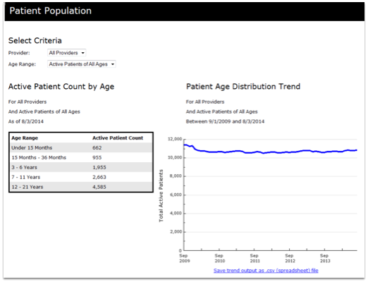
Use the graph to track your age distribution over time, as a practice or for a single provider. The box at the left presents your current total, and the graph on the right allows you to track your age distribution over time. You can select a single provider or all providers, and optionally limit by age range.